Virgin Galactic
BRANDING | INTERACTIVE INSTALLATION
Conceptual Project
Spring 2014
Adobe Design Achievement Award 2015 Entry
Brand Guidelines and Process Book are available upon request
THANKS TO:
Gerardo Herrera
Miles Mazzie
Phil Enzler
Ivan Cruz
Brand Guidelines and Process Book are available upon request
THANKS TO:
Gerardo Herrera
Miles Mazzie
Phil Enzler
Ivan Cruz
The rebrand project foresees Virgin Galactic brand fifty years in the future, where the corporation will have expanded their target audience to a middle-class towards high-class thrill-seekers.
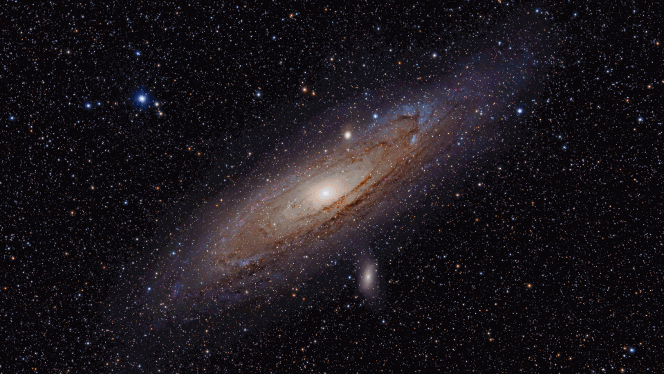
The trip to space can also be about achieving your spirituality and calmness. Virgin Galactic invites you on a journey of your lifetime so you can admire the space as a part of nature, and to remind you how small you are compared to this vast universe.
The trip to space can also be about achieving your spirituality and calmness. Virgin Galactic invites you on a journey of your lifetime so you can admire the space as a part of nature, and to remind you how small you are compared to this vast universe.
"I didn't feel like a giant, I felt very, very small."
— Neil Armstrong on his mission to the moon

Brand Concept
The idea of the logo comes from the movement of outer space elements. They share similar orbiting pattern, which is circular. Everything in space moves in circle as they follow the central gravity that has a bigger mass. So far, the humanity has witnessed these orbiting from afar. We are a part of the orbiting process but we never see how orbiting from up close looks like.
Thus, Virgin Galactic’s mission is to bring the mankind to space so they can also not only witness, but experience the orbiting process. The circular movement can also represent “one”. Virgin Galactic aims to bring the mankind closer to the universe, to feel it around them, and to experience its majesty and greatness.
Thus, Virgin Galactic’s mission is to bring the mankind to space so they can also not only witness, but experience the orbiting process. The circular movement can also represent “one”. Virgin Galactic aims to bring the mankind closer to the universe, to feel it around them, and to experience its majesty and greatness.
Brand Colors
ADMIRING NATURE’S BEAUTYVirgin Galactic hopes that your trip to the outer space is a chance for you to admire nature's beauty at its most majestic level.
The colors are inspired by those of natural elements, in this case: sunset and night blue sky. Not only sunset and night blue sky offer nature’s utmost unique colors, but they make a complimentary color set. The use of gradient is chosen rather than solid color to strengthen the subtlety and spiritual attitudes of Virgin Galactic brand.
The colors are inspired by those of natural elements, in this case: sunset and night blue sky. Not only sunset and night blue sky offer nature’s utmost unique colors, but they make a complimentary color set. The use of gradient is chosen rather than solid color to strengthen the subtlety and spiritual attitudes of Virgin Galactic brand.

POSTER SERIES


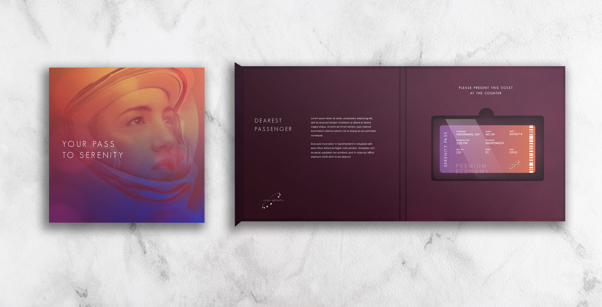
Serenity Pass
Serenity Pass is a special term referring to Boarding Pass for Virgin Galactic flyers. However, since Virgin Galactic offers a flight experience unlike any other, Serenity Pass is designated both as a functional ticket as well as a souvenir passengers can keep as a memorable token of their journey. Hence, the pass is encased in light acrylic which the passengers can keep and display as a decoration at home.
The Serenity Pass comes in a small box and is placed in a velvet bedding for an additional premium quality complete with a welcome message.
The Serenity Pass comes in a small box and is placed in a velvet bedding for an additional premium quality complete with a welcome message.


Website


APP


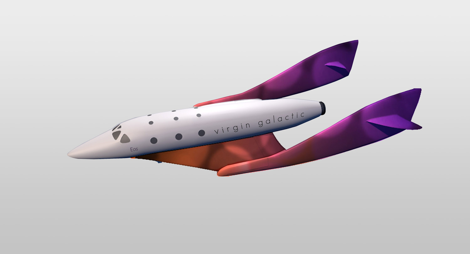
Vehicles Livery and Renaming
To increase the brand experience, two core spaceplanes (White Knight Two and SpaceshipTwo) of Virgin Galactic would be renamed. The spaceplanes will thus be renamed after the Greek goddesses to carry the essence of the brand sophistication.


SPACESHIPS
Andromeda
Even though being nearly sacrificed to the gods, Andromeda in the mythology is portrayed as a strong woman, thus reflects the spaceship named after her. Spaceship Andromeda is also named after the galaxy, whose shape draws the inspiration of the brand logo
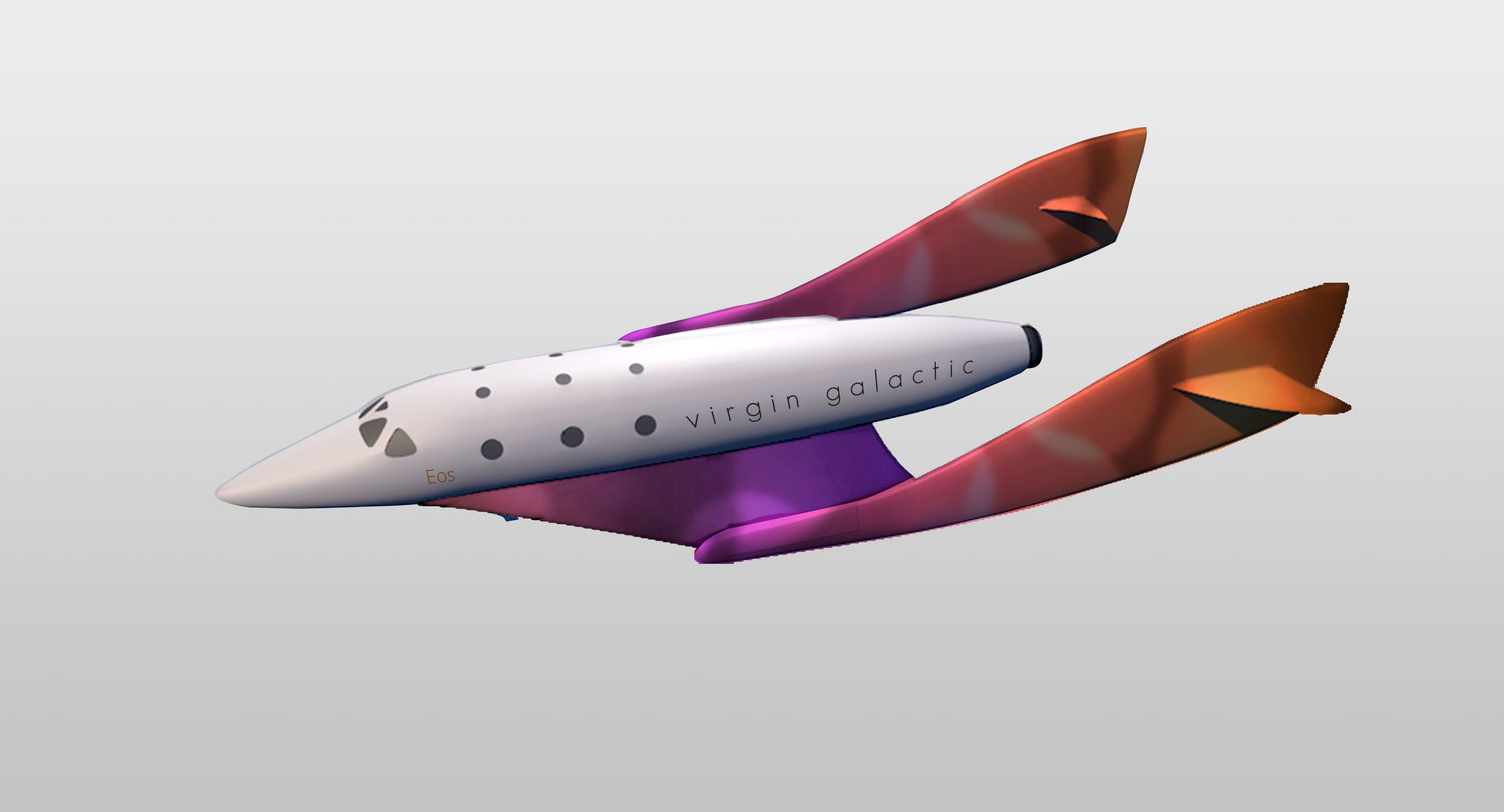
Eos
Named after from the goddess of dawn, Eos is a Spaceship two, with the characteristics of orange gradients at the tail that transitions to purple towards the middle of the spaceship. The orange is inspired by the color of dawn, thus, the name of the Goddess

ENVIRONMENTAL LIVERY


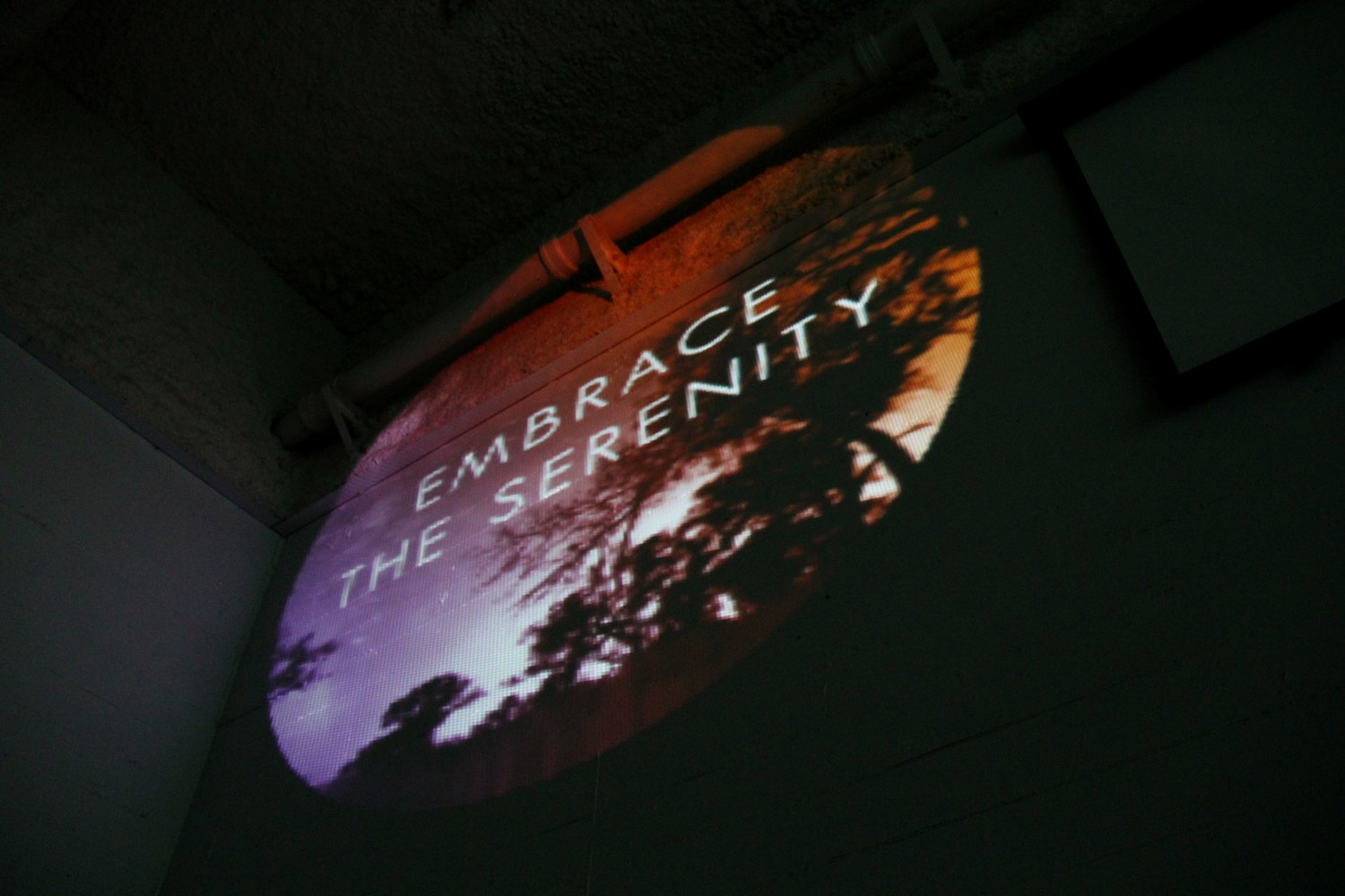
Embrace the
Serenity
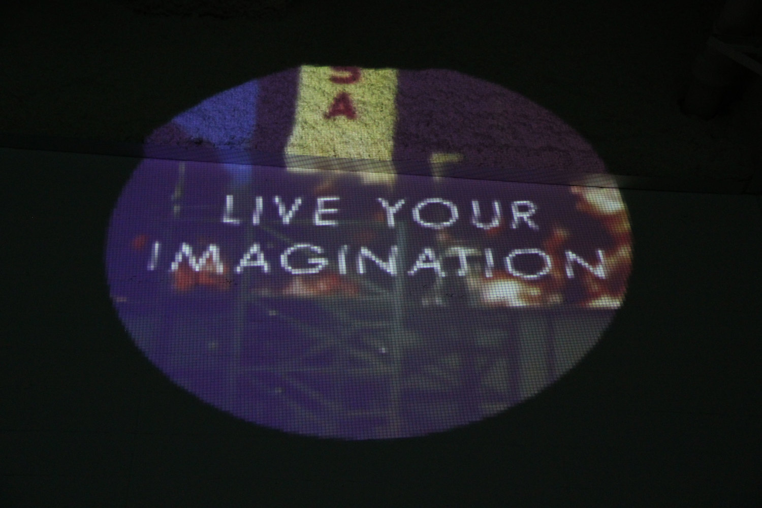
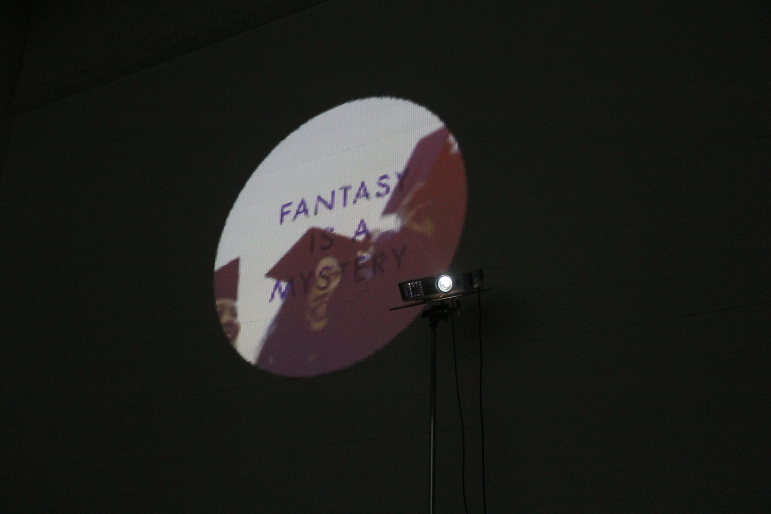
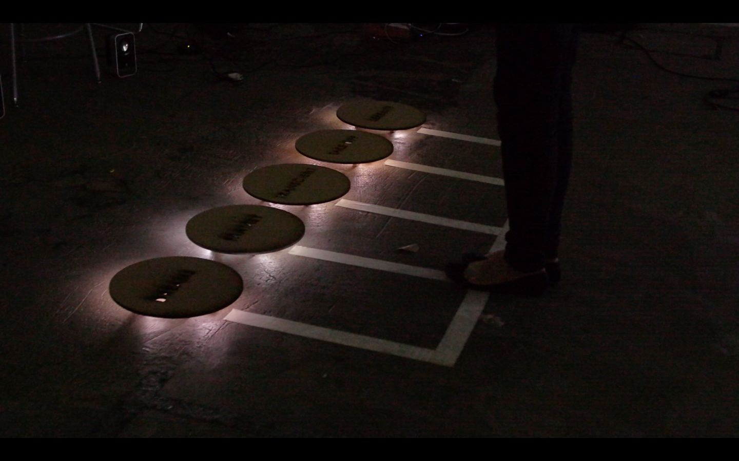
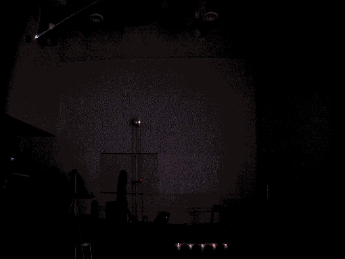
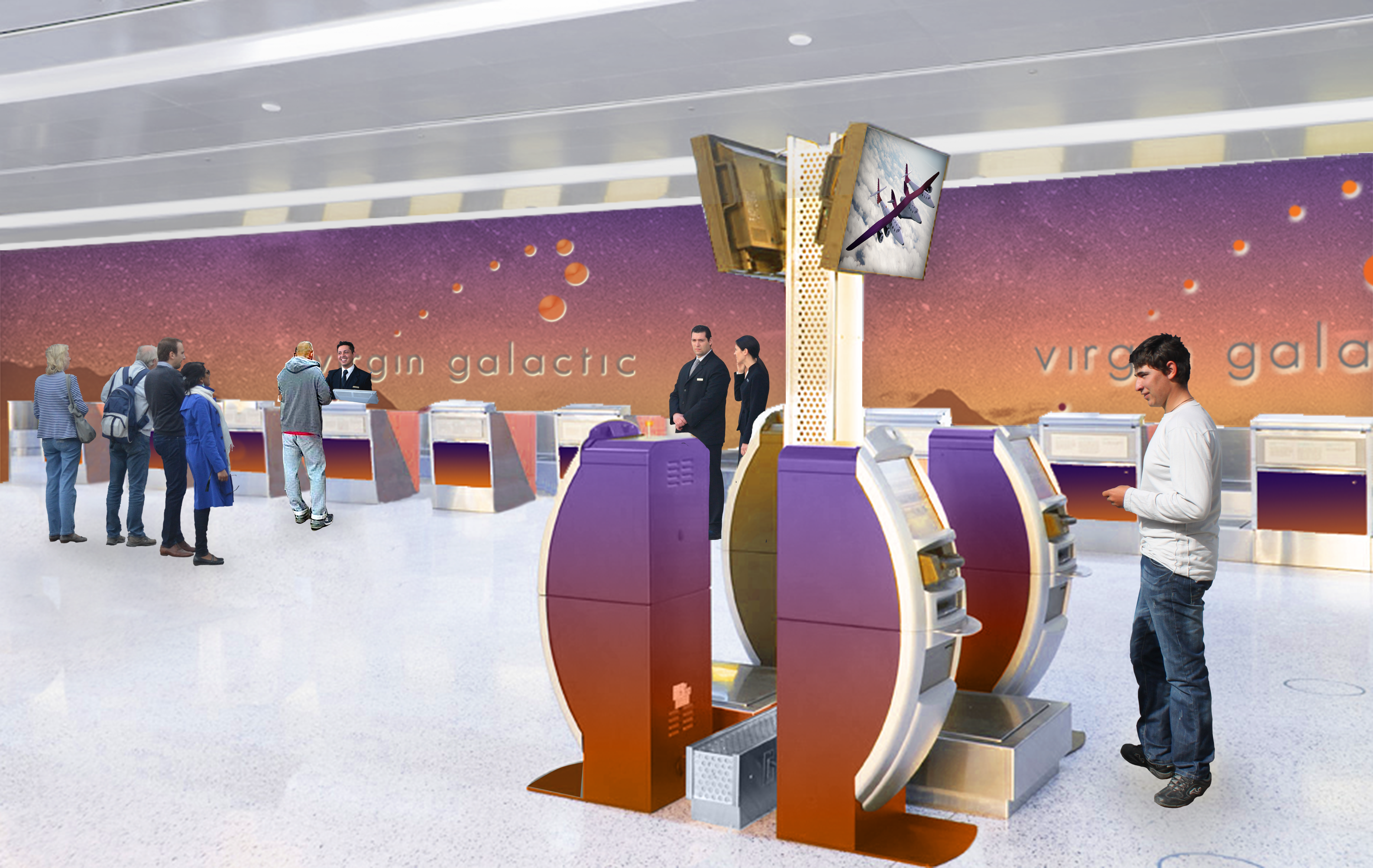
AN INTERACTIVE INSTALLATION
Embrace the Serenity Installation serves as a conceptual, promotional campaign to introduce people to Virgin Galactic. The installation invites you to take a trip to space as a journey to enliven your dreams and imagination.
Created using Processing Program and utilizing Kinect motion sensor, people are invited to interact with each word marked on the floor and discover the information on the wall.
Created using Processing Program and utilizing Kinect motion sensor, people are invited to interact with each word marked on the floor and discover the information on the wall.